
More products should mean more sales. A bigger catalog serves more needs, ranks for more searches and gives every visitor something that fits. That is the theory.
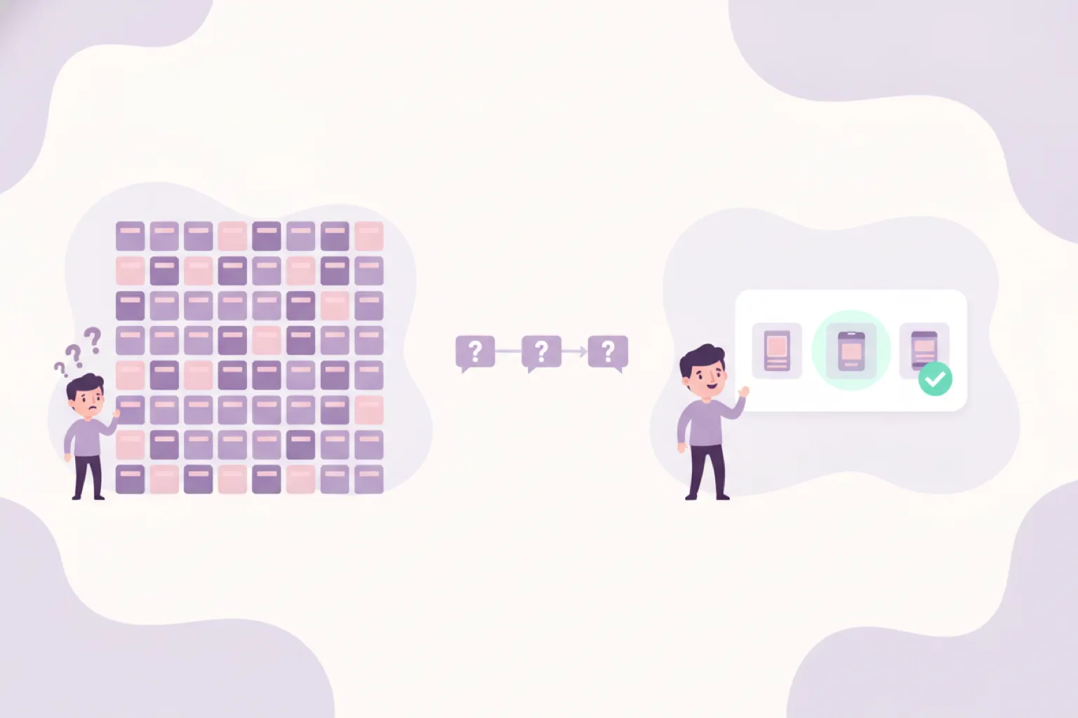
In practice, many webshops see the opposite: category pages with hundreds of options, high traffic, and visitors who leave without buying anything. Not because the right product was missing, but because choosing it felt like work.
That effect has a name: choice overload. And it is one of the best-documented findings in consumer psychology.
The jam study: fewer options, ten times more sales
In 2000, researchers Sheena Iyengar and Mark Lepper set up a tasting booth in a grocery store. Some days it displayed 24 flavors of jam, other days only 6.
The large display attracted more attention: 60% of passers-by stopped, against 40% for the small one. But attention did not become revenue. Of the people who saw 24 jams, 3% bought one. Of the people who saw 6 jams, 30% did.
Ten times the conversion, from a smaller assortment. The big display was better at starting the buying journey and worse at finishing it.
That is the pattern to remember: abundance attracts, but it does not convert.
Why the brain gives up
Choice overload is not one effect but several psychological mechanisms stacking up:
- Decision time grows with options. Hick's law describes how every extra option increases the time needed to decide. On a category page with 200 products, "just have a look" quietly becomes a serious cognitive task.
- Comparison is expensive. Evaluating one product against another costs mental energy. With ten similar products, the number of comparisons explodes. Most shoppers do not finish that work; they abandon it.
- Fear of regret rises. Psychologist Barry Schwartz called this the paradox of choice: the more alternatives you reject, the easier it is to imagine that one of them was better. More options mean more ways to be wrong.
- Postponing feels safe. When no option is clearly right, "I'll decide later" feels like the rational move. In ecommerce, later usually means never, or at a competitor with a clearer offer.
- Satisfaction drops. Even shoppers who do buy from a huge assortment report less satisfaction with their choice. That shows up later as doubt, support tickets and returns.
None of this means shoppers want tiny catalogs. They want large catalogs that feel small at the moment of choosing.
How choice overload looks in your analytics
Choice overload rarely announces itself. It hides inside metrics that look like traffic or UX problems:
- category pages with high traffic and low click-through to products;
- visitors bouncing between product pages without adding to cart;
- long sessions that end without a purchase;
- carts abandoned after a final round of comparing;
- recurring "which one should I pick?" questions in support;
- returns explained by "not quite what I needed".
If several of these sound familiar, the problem is probably not your products or your pricing. It is the amount of unassisted choosing you ask visitors to do.
Why filters alone do not fix it
The standard answer to a large catalog is filtering. Filters do reduce the number of visible products, but they fail choice overload in two ways.
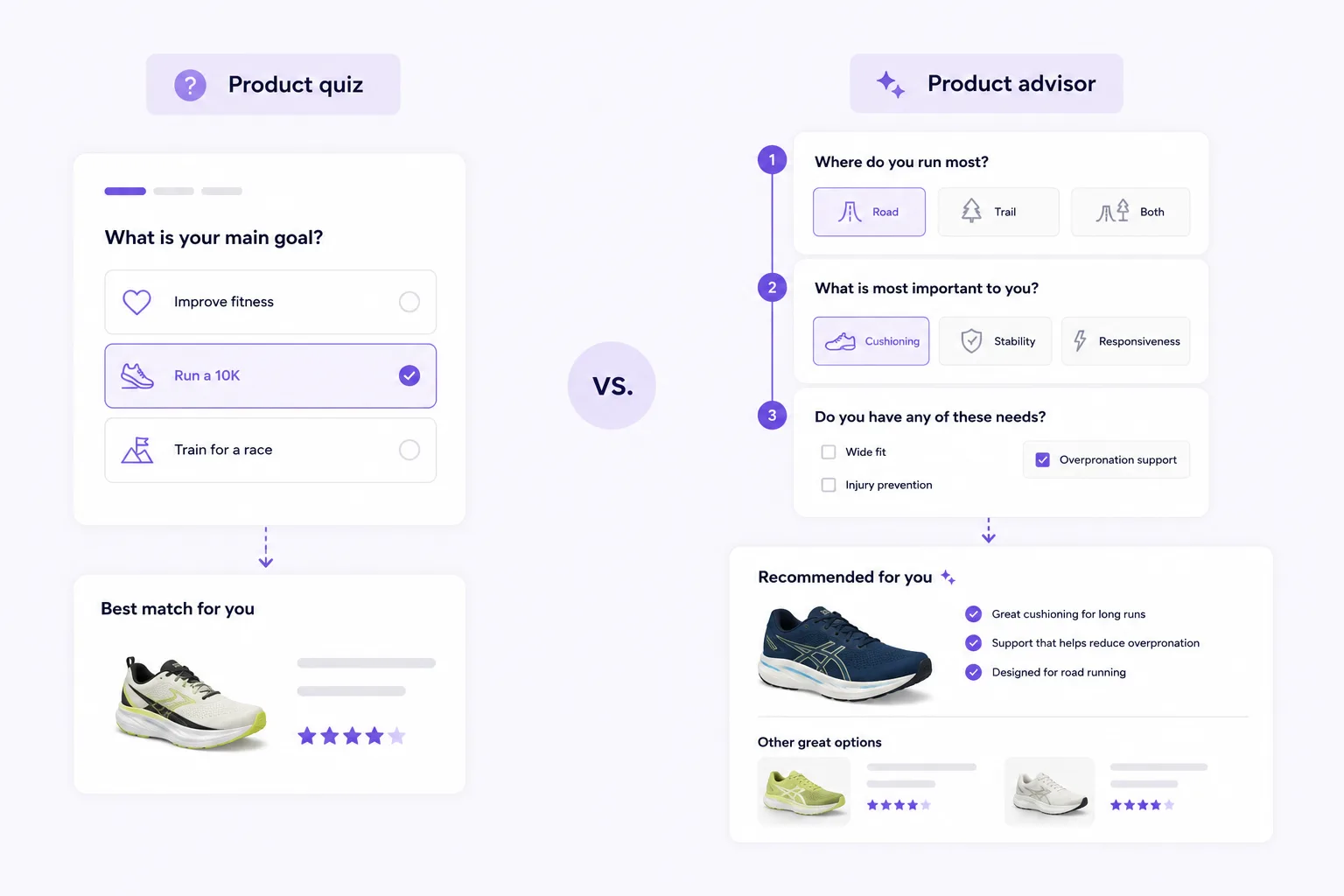
First, filters demand knowledge the overwhelmed shopper does not have. To filter on wattage, material or mounting system, you already need to know which value fits your situation. The visitor with choice stress is exactly the visitor who does not know that yet. We wrote about that gap in why product filters fall short.
Second, filters reduce the count, not the uncertainty. Going from 200 products to 30 still leaves 30 open comparisons and the same fear of picking wrong. The mental work that causes the drop-off is untouched.
Filters are a refinement tool for people who know what they want. They are not an advice tool for people who do not.
What actually works: shrink the choice, not the catalog
The goal is not fewer products. It is fewer decisions per visitor. Three approaches do the heavy lifting:
1. Curate the entry points
"Bestsellers", "our picks for beginners" or a top-3 per use case gives hesitant visitors a starting point that feels safe. A default option is not a limitation; it is a service. Most shoppers are happy to accept a good suggestion.
2. Make differences explainable
Shoppers do not abandon because there are ten products. They abandon because the ten look the same. Short comparison content, "choose this if..." labels and honest trade-offs reduce the fear of picking wrong.
3. Ask instead of display
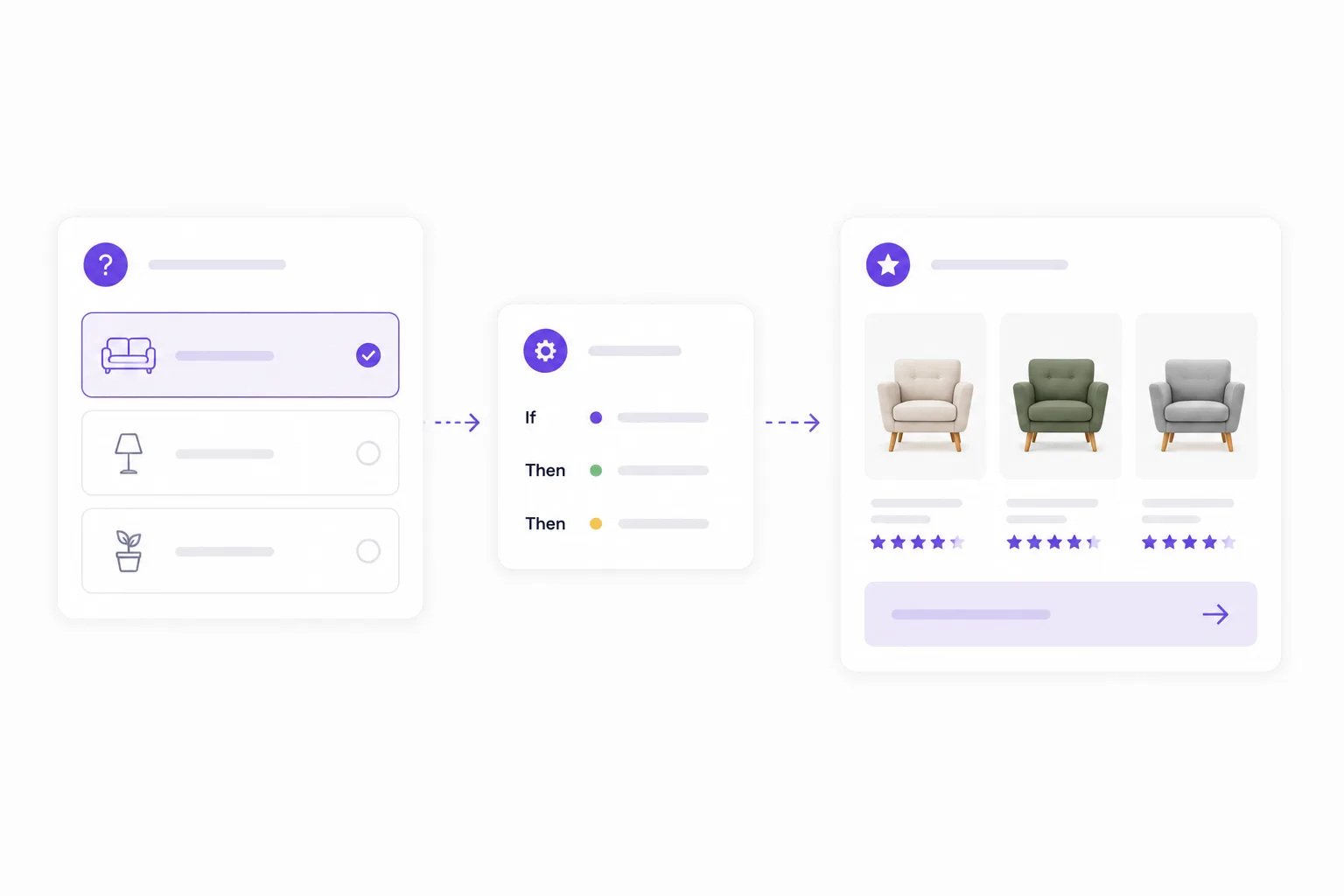
The most direct fix is guided selling: ask a few questions about the situation, not the specs, and translate the answers into a shortlist.
This works because it attacks every mechanism above at once. Three questions replace two hundred comparisons. Customer language replaces spec knowledge. A shortlist of two or three products with an explanation of why they fit replaces the fear of regret with confidence.
That explanation matters more than the recommendation itself. "Recommended for you" is a claim. "Recommended because you chose a small garden and low maintenance" is a reason. Reasons convert.
Doing this with BerryPath
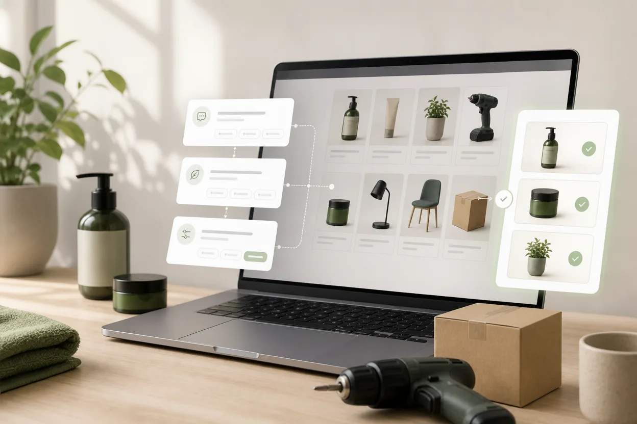
This is exactly where choice helper software for webshops helps. With BerryPath, you create an advice flow with four to seven questions in customer language, connect answers to your product data, and place the Flow widget where choice stress peaks: large category pages, landing pages or product pages where shoppers want to check their choice.
For that last scenario, product advice on product pages can be enough: a short check that confirms whether the viewed product fits or calmly points to a better match.
Answers can be hard requirements or soft preferences, so one strict answer does not lead to a dead end with zero results. The result page shows a short list of matching products and explains why each one fits.
Start with one category: the one with the most products, the most support questions or the highest bounce. Measure completion and click-through to recommended products, then expand. You can try a live demo to feel the difference between filtering and being advised.
The takeaway
Choice overload is not a niche psychology fact. It is the default state of a visitor on a large category page. Attention rises with assortment size; conversion does not.
Keep the big catalog. Just stop asking every visitor to process it alone. Curate the entry, explain the differences, and let a short conversation carry shoppers from "too many options" to "this one fits me".