
The product page is where the purchase decision is won or lost. The biggest gains rarely come from a full redesign. They usually come from a handful of small, cheap-to-implement changes around the buy button, the price and your social proof.
These are the patterns that keep coming back in real-world product page optimization. No tricks, just changes that match how visitors actually buy. Use this as a checklist and test each one on your own store, because every audience reacts a little differently.
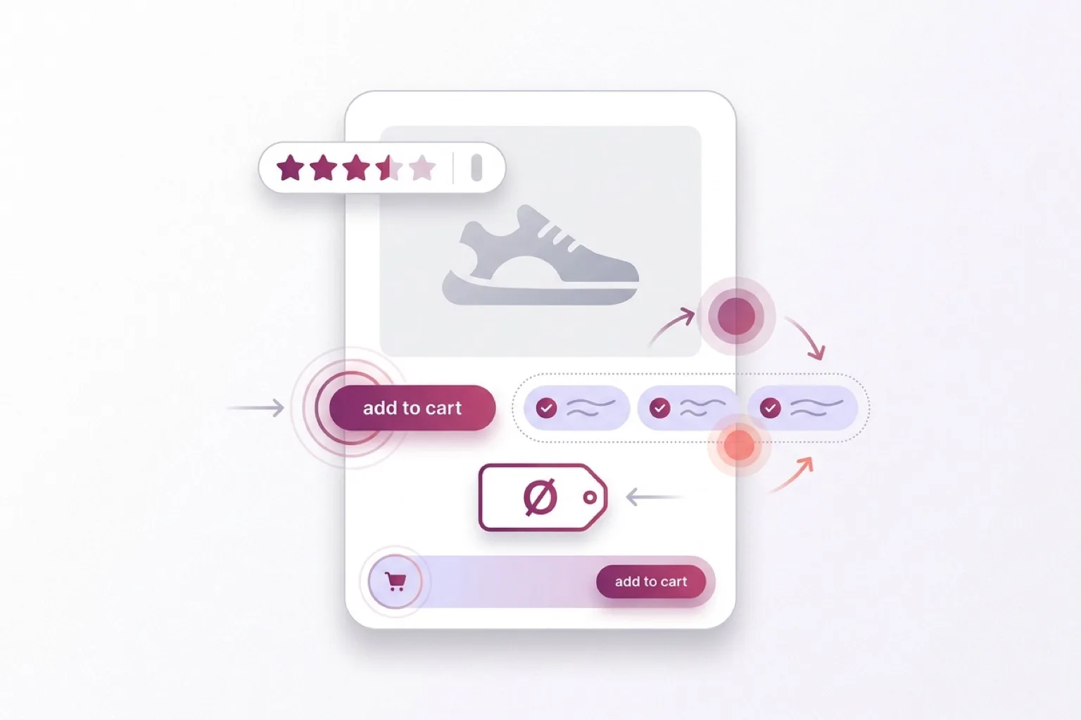
The buy button: your most important pixel
Put USPs right next to the add-to-cart button
The moment someone is about to click, they hesitate briefly: free shipping? easy returns? in stock? Place three to five short USPs right by the button and you answer that doubt exactly at the decision moment, instead of at the top of the page the visitor already scrolled past.
- Keep them short and scannable, with an icon per point.
- Show your strongest differentiators, not the claims every shop makes.
- Limit to four to six USPs; more becomes noise.
Make the buy button sticky on mobile
On mobile the button scrolls out of view the moment someone reads specs or reviews. A sticky buy bar keeps the action within thumb reach at all times, so you don't lose a click to scrolling back up. Works best on long mobile product pages. Make sure the bar doesn't cover key content or the system bar.
Keep the buy button above the fold
If the visitor has to pass half a page of content before they can buy, you lose the quick decision-makers. Buy button, price and your key USPs visible without scrolling gives the most direct route to the cart.
Mind your CTA copy
The words on the button shape the sense of commitment. A term like "add to cart" feels more low-commitment than a directive "order now". A one-word difference can have a measurable effect, so put it on your test list.
Order and hierarchy
Put the product description below the button and USPs (mobile)
Most mobile visitors want to be able to buy first and read later. The order "button and USPs first, long description after" matches that behavior and keeps the purchase action reachable.
Move social proof up
Reviews at the bottom of the page often go unseen. A short summary (stars plus number of reviews) high on the page builds trust early, before doubt sets in. The full reviews can stay lower down.
Price perception
Don't over-emphasize the price
A heavily enlarged price amplifies the "pain of paying". Showing the price a little more calmly lowers that psychological friction without hiding anything. Test this per category: for bargain hunters a prominent price sometimes works better.
Add context with a reference price
An advised or was-price next to the current price gives the value context. Important: only do this if it's honest and accurate. A false was-price harms trust and is legally not allowed.
Confirmation and next step
Confirm the add to cart
A short "added" confirmation removes uncertainty (did it work?) and is the natural moment for a relevant cross-sell or a nudge toward checkout. Keep it calm and non-intrusive; an aggressive pop-up does more harm than good.
Product page CRO checklist
Run through these points before your next test:
- Are your strongest USPs right by the buy button?
- Is the buy button sticky and always reachable on mobile?
- Are button, price and core USPs above the fold?
- Is your CTA copy phrased to feel low-commitment?
- On mobile, does the purchase action come before the long description?
- Is a review summary high on the page?
- Is your price hierarchy (and any reference price) correct?
- Do you confirm the add to cart clearly?
Test it, don't guess it
These are directions that often work, not guarantees. Every shop has a different assortment, audience and price range. Run an A/B test where you can and look at your own numbers before making a change permanent. Start with the low-effort, high-potential changes, like USPs by the button and a sticky buy bar.
When optimization isn't enough
The above mostly helps the visitor who already knows what they want. But a large share of your traffic is still choosing between products, doesn't know the right specifications, or isn't sure what fits their situation. For that group you don't improve a button, you help them choose.
That's where product advice on the product page comes in, and more broadly a product finder that guides shoppers to the right product with a few questions. Filters help those who know what they're after; read why filters fall short the moment the visitor doesn't. Good recommendations also rely on clean product data for matching.
Frequently asked questions
Which product page change pays off fastest?
Usually the combination of USPs by the buy button and a sticky buy button on mobile. Both are low effort and hit the decision moment directly. Start there and measure the effect.
Should I A/B test every change?
With enough traffic, yes. Product page effects are often small but valuable, and what wins on one shop loses on another. If traffic is low, ship sensible improvements and judge them over a longer period.
Does product page CRO help hesitant visitors too?
Partly. You reduce friction, but you don't solve choice stress. Someone who doesn't know which product fits needs guidance, not a better button. So combine product page CRO with a product finder.
Start with one test
Pick one item from the checklist and set up a test this week. Want to help hesitant visitors choose as well as optimize? See the demo, read how to build an Advice Flow, or dive into the product advice tool for webshops.
Quick answers
Is guided selling better than filters?
Where should a product finder live?
Do I need developers for every change?
Keep building the picture
A few useful next reads and product pages that connect this article to the rest of the guided selling stack.
Useful product pages