
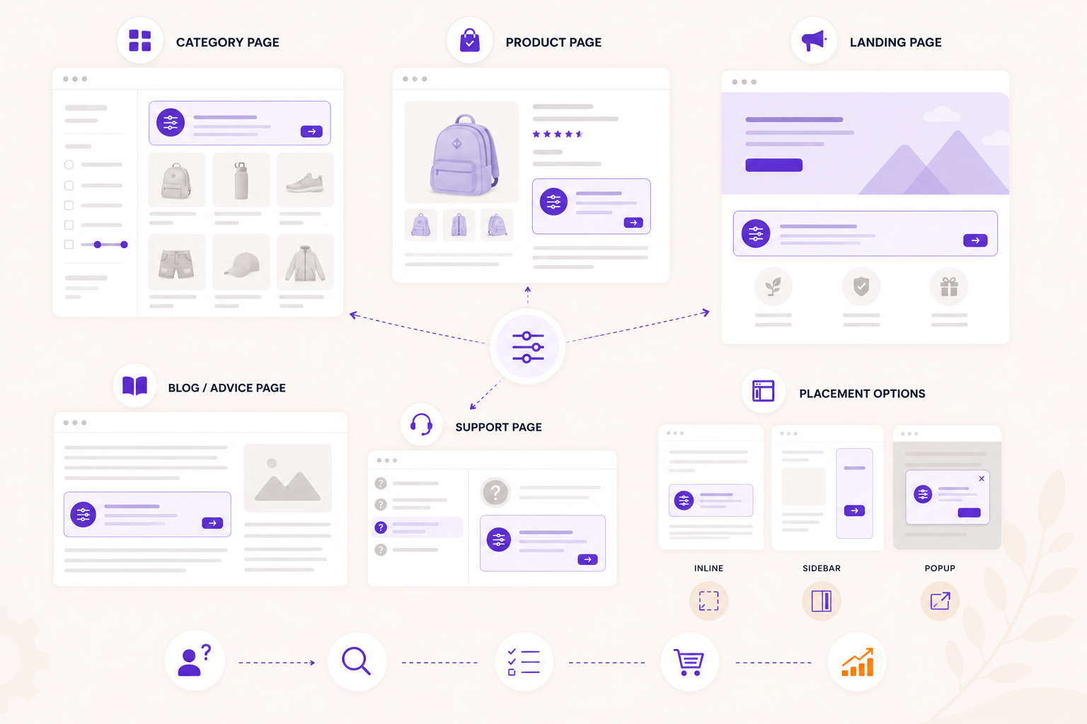
A product finder only helps when visitors see it at the right moment.
Many teams place a widget on the homepage and stop there. That is usually not enough. Shoppers do not only hesitate at the entrance of a store. They hesitate inside categories, on product pages, after reading specs, during campaigns and when comparing alternatives.
The best placement depends on the question the visitor is trying to answer.
Category pages: narrow a broad range
Category pages are the most obvious place for a product finder. They work especially well when the visitor sees many similar products.
Use this placement when:
- the category has many variants;
- filters are technical;
- shoppers often ask "which one do I need?";
- the first product click is hard to choose.
Place the entry point high enough to be noticed, but do not block the product list. A short label works better than a long explanation. For example: "Find the right cleaner" or "Help me choose".
Product pages: confirm or redirect
Product pages are often overlooked. Many visitors land directly on a product page from search, ads or email. They may not be comparing categories anymore. They are asking: "Is this product right for me?"
A product-page check can:
- confirm that the current product fits;
- explain why it fits;
- show a better alternative if it does not;
- reduce doubt before the add-to-cart click.
This placement is useful when products are technical, compatibility-driven or easy to buy wrong.
Landing pages: turn campaigns into advice
Campaign traffic often arrives with context: a season, problem, audience or offer. A product finder can turn that context into a guided route.
Examples:
- a winter car-care guide;
- a starter kit finder;
- a gift finder;
- a campaign around one use case;
- a buying guide for a new collection.
The page gives context. The flow helps the visitor choose.
Blog and advice pages: continue after education
Informational content attracts visitors who are still learning. A product finder gives those visitors a practical next step.
Place the widget after the main explanation or near a section where the reader has to apply the advice to their own situation.
For example, a page explaining product differences can end with: "Not sure which one fits your situation? Answer a few questions."
Support pages: reduce repeated questions
If support receives the same buying questions every week, consider turning the answer into a flow.
This is useful for:
- compatibility checks;
- size or fit advice;
- product care decisions;
- replacement parts;
- starter kits;
- safety or material questions.
The goal is not to hide support. The goal is to give visitors a clear self-service route before they need to ask.
Popup, sidebar or inline?
The layout should match the moment.
Inline works well when the advice is central to the page, such as a buying guide or category advisor.
Popup works well when the product finder is optional help. Use it with a clear trigger, not as an interruptive takeover.
Sidebar is useful when visitors should keep the page visible while answering.
There is no single best format. Test based on visibility, completion and product clicks.
Use analytics to decide
After launch, compare placements:
- which entry point gets started most;
- which placement has the highest completion rate;
- which result view drives product clicks;
- which page type leads to better assisted conversion;
- where visitors still drop off.
Move or duplicate the Flow widget based on behavior. A product finder can serve multiple moments, but each placement should have a clear job.
Place it where doubt appears
The best rule is simple: place the product finder where the visitor has a decision to make.
If the question is "which category?", use a homepage or landing-page route. If the question is "which product in this category?", use a category advisor. If the question is "does this product fit me?", use a product-page check.
Good placement makes guided selling feel helpful instead of decorative.
How to choose product finder placements
Place guidance where shoppers slow down, not only where the catalog begins.
- 1 Start with category pages Use product finders where broad product groups create choice stress.
- 2 Add product page checks Help shoppers confirm whether the product they are viewing fits.
- 3 Support buying guides Turn educational content into an interactive route to a recommendation.
- 4 Use campaign traffic Send paid, email or social visitors into a focused advice flow.
- 5 Measure each entry point Compare starts, completion and product clicks per placement.
Quick answers
Is guided selling better than filters?
Where should a product finder live?
Do I need developers for every change?
Keep building the picture
A few useful next reads and product pages that connect this article to the rest of the guided selling stack.
Useful product pages